What is report support?
You can activate report support on the Data tab. If you do so, the data will be read from ARIS by a report right before the dialog is displayed and will then be displayed in the dialog when the task is opened for editing. You can dynamically change the displayed name (label) of all elements using a report. If the task is displayed read-only, the report is not executed.
If you want to use a single report for all dialog elements, you must use the element identifiers to pass on the values for the individual dialog elements. In this case, you must activate the report support for one single element only (see example below).
Report support can be enabled for the following elements. If an element can process multiple values, use a comma-separated list in the report.
If you want to use a separator other than a comma, specify the separator in the report script code. Make sure that the separator specified is not used in the values of the list.
If you want to use #~# as a separator, add the following code to the report script:
var separator = "#~#";
Context.setProperty("separator", separator);
The graphic shows a dialog with a User element, a Date and time element, and an Input table element. The identifier of the User element and the report ID are highlighted:
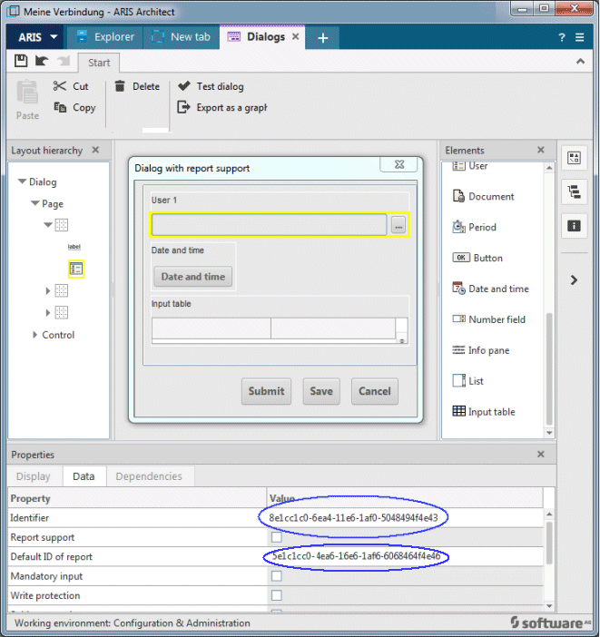
If you want to use a single report to pass data for the field shown above, the report must contain the following lines (the values are comma-separated by default):
Context.setProperty("8e1cc1c0-6ea5-11e6-1af0-5048494f4e43.selection","johndoe");
Context.setProperty("5e1c1cc=-4ea6-16e6-1af6-6068464f4e46.value", "2018-06-03");
Context.setProperty("5e1c1cc=-4ea6-16e6-1af6-6068464f4e46.column1", "value1, value2");
If you want to use #~# as a separator, add the following code:
var separator = "#~#";
Context.setProperty("separator", separator);
Context.setProperty("8e1cc1c0-6ea5-11e6-1af0-5048494f4e43.selection"#~#"johndoe");
Context.setProperty("5e1c1cc=-4ea6-16e6-1af6-6068464f4e46.value"#~# "2018-06-03");
Context.setProperty("5e1c1cc=-4ea6-16e6-1af6-6068464f4e46.column1"#~# "value1#~# value2");
Click the relevant element to display the details.
The Check box element consists of a name and the check box itself. The check box represents a Boolean value. Inline editing is possible.
On the Data tab, you can specify whether the element is a mandatory field, is read-only, or is subject to voting. You can activate report support here, too. Enter the GUID of the relevant report in the Default ID of report field. If you do so, the data will be determined by report right before the dialog is displayed and will then be displayed in the dialog.
Context.setProperty("375ade20-6ea5-11e6-1af0-504e43.value", "true");
The Check box list element has a label and several check boxes. You can define the number of check boxes. The label can be deleted on the Display tab or by clearing the Has label check box.
On the Data tab, you can specify whether the element is a mandatory field, is read-only, or is subject to voting. You can activate report support here, too. Enter the GUID of the relevant report in the Default ID of report field. If you do so, the data will be determined by report right before the dialog is displayed and will then be displayed in the dialog.
Further check boxes can be added on the List entries tab.
Example with three check boxes with default value true for the second check box.
Context.setProperty("375ade20-6ea5-11e6-1af0-504e43.value","false,true,false");
The Date and time element has a label and is an input box for a date and time stamp. The label can be deleted on the Display tab or by clearing the Has label check box. Inline editing is possible.
You can activate report support on the Data tab. If you do so, the data will be read from ARIS by a report right before the dialog is displayed and will then be displayed in the dialog when the task is opened for editing. You can dynamically change the displayed name (label) of all elements using a report. If the task is displayed read-only, the report is not executed.
On the Data tab, a date with a time accurate to the nearest second can be preset in the Value field.
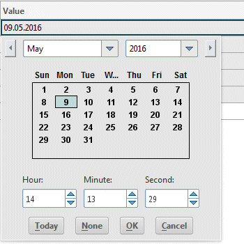
The Date and time element is structured as follows:
List for selecting the month
List for selecting the year
Calendar section for selecting the day
Box for selecting the hour
Box for selecting the minute
Box for selecting the second
Today button for selecting the current date
None button, which enables you to define no date or to discard the selected date
OK button for accepting entries
Cancel button for discarding entries
On the Data tab, you can specify whether the element is a mandatory field, is read-only, or is subject to voting.
Context.setProperty("375ade20-6ea5-11e6-1af0-504e43.value", "2016-10-03");
The Dynamic combo box element has a label. The label can be deleted on the Display tab or by clearing the Has label check box.
On the Data tab, you can specify whether the element is a mandatory field, is read-only, or is subject to voting. You can activate report support here, too. Enter the GUID of the relevant report in the Default ID of report field. If you do so, the data will be determined by report right before the dialog is displayed and will then be displayed in the dialog.
Further list entries can be added on the List entries tab. You can assign a name and a value to the individual entries in this list.
The values for dynamic combo boxes are not localizable. Values and labels will always be the same for each combo box entry. Available values can be defined during runtime.
Context.setProperty("availableValues","1,2,3,4");
Context.setProperty("375ade20-6ea5-11e6-1af0-504e43.value","2");
The Hyperlink element has a name and represents either a hyperlink (for example, https://www.aris.com), or a shortcut to ARIS Architect models. Inline editing is possible.
On the Data tab, you can specify whether the element is a mandatory field, is read-only, or is subject to voting. You can activate report support here, too. Enter the GUID of the relevant report in the Default ID of report field. If you do so, the data will be determined by report right before the dialog is displayed and will then be displayed in the dialog.
Context.setProperty("375ade20-6ea5-11e6-1af0-504e43.value", "https://www.myServer/myPage.htm");
The Input table item has a name and represents a table. You can define the number of lines. On the Display tab, you can change the name and specify it in various languages. You can specify whether a hyperlink is displayed only with an icon or with an icons and a text.
You can activate report support on the Data tab. If you do so, the data will be read from ARIS by a report right before the dialog is displayed and will then be displayed in the dialog when the task is opened for editing. You can dynamically change the displayed name (label) of all elements using a report. If the task is displayed read-only, the report is not executed.
You can use the Columns tab to edit the number and position of columns. The number of rows depends on the number of entries in a list that are connected to the corresponding column in the data flow. Use the Item type column on the Columns tab to define the item type to be displayed when editing a task in the dialog. These are available:
Check box
Hyperlink
Text box
Option button
You can define dependencies among columns on the Column dependencies tab. For example, if the source column contains a check box that can be enabled or disabled, it affects the behavior of the target column. The target column could then contain different text. You can only define dependencies between two columns.
Note that you must define all behaviors. For example, if the check box in the first column is enabled, you also have to specify the behavior if the check box in the first column is not enabled.
Context.setProperty("375ade20-6ea5-11e6-5023875e3a.column1", "value1, value2");
You can set the value(s) for option button columns the same way as for all other column types via report-support. The code for four option buttons, where the last one is ticked, looks as follows:
Context.setProperty("columnName","false,false,false,true");
The Number field element has a label and is used for entering numbers. It is a spin box with arrows for increasing or reducing the numerical value. Values can also be entered directly. The label can be deleted on the Display tab or by clearing the Has label check box. Inline editing is possible.
You can activate report support on the Data tab. If you do so, the data will be read from ARIS by a report right before the dialog is displayed and will then be displayed in the dialog when the task is opened for editing. You can dynamically change the displayed name (label) of all elements using a report. If the task is displayed read-only, the report is not executed.
The following example shows example code for the report support:
Context.setProperty("375ade20-6ea5-11e6-1af0-504e43.value","1");
The Option button group element has a label. The label can be deleted on the Display tab or by clearing the Has label check box.
The available values whether the option buttons are ticked or not, can be passed at design time or dynamically during the process runtime by a dataflow or a report. Only one option button in such a group can be checked at any one time.
Further option buttons can be added on the List entries tab. You can assign a name and a value to the individual option buttons in this list.
Context.setProperty("availableValues","Yes,No,Maybe");
Context.setProperty("value","No");
The Text area element has a label and allows multiple text lines to be entered. You can specify the number of lines to be displayed at runtime. The label can be deleted on the Display tab or by clearing the Has label check box. Inline editing is possible.
On the Data tab, you can specify whether the element is a mandatory field, is read-only, or is subject to voting. You can activate report support here, too. Enter the GUID of the relevant report in the Default ID of report field. If you do so, the data will be determined by report right before the dialog is displayed and will then be displayed in the dialog.
Context.setProperty("375ade20-6ea5-11e6-1af0-504e43.value","This is my first line.,This is my second line.");
The Text box element has a label and is used for entering a single text line. The label can be deleted on the Display tab or by clearing the Has label check box. Inline editing is possible.
On the Data tab, you can specify whether the element is a mandatory field, is read-only, or is subject to voting. You can activate report support here, too. Enter the GUID of the relevant report in the Default ID of report field. If you do so, the data will be determined by report right before the dialog is displayed and will then be displayed in the dialog.
You can specify a validation. This means that the input in the dialog will be checked when a task is edited. The following validations are available:
No validation (text box input is not checked)
Must not be specified (the box must not be completed)
Must be specified (the box must be completed)
E-mail address (a valid e-mail address must be entered)
Floating point number (a valid floating point number must be entered)
Context.setProperty("375ade20-6ea5-11e6-1af0-504e43.value","This is my text.");
The User element consists of a label and Browse. If this button is clicked during editing of a human task, a dialog showing all active users opens. Active users are users that have been modeled as active users in the organizational chart or defined by LDAP.
The label can be deleted on the Display tab or by clearing the Has label check box.
On the Data tab, you can specify whether the element is a mandatory field, is read-only, or is subject to voting. You can also specify whether only users, user groups (and their quantity) or both are allowed. When running the dialog, the users or user groups offered for selection will change accordingly.

The dialog shown here is visible only when executing the process, not during the dialog test.
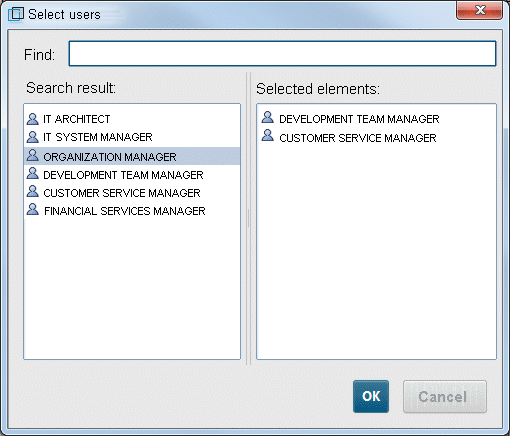
In the Find window, you can search for users, user groups, or login IDs. The Search result area displays the search result, that is, all active users and user groups that exist in the system. They can be selected by double-clicking. You remove them from the selection using  Delete. To display all persons belonging to a user group, double-click the relevant user group.
Context.setProperty("usergroupFilter","MyGroup");
To set the list of selected users and user groups, specify their names as a comma-separated String:
Context.setProperty("selection","jsmith,jdoe,jadoe");